CSS Box Shadows Examples
Elevate your website's visual appeal and engage your audience like never before with CSS Box Shadows.
1
Click to copy!
Thin Shadow
2
Click to copy!
Soft Shadow
3
Click to copy!
Subtle Shadow
4
Click to copy!
Delicate Shadow
5
Click to copy!
Light Shadow
6
Click to copy!
Gentle Shadow
7
Click to copy!
Minimal Shadow
8
Click to copy!
Feather Shadow
9
Click to copy!
Elegant Shadow
10
Click to copy!
Smooth Shadow
11
Click to copy!
Subtle Shadow
12
Click to copy!
Soft Shadow
13
Click to copy!
Hard Shadow
14
Click to copy!
Tiny Shadow
15
Click to copy!
Neon Glow
16
Click to copy!
Inner Shadow
17
Click to copy!
Raised Box
18
Click to copy!
Sunset Glow
19
Click to copy!
Soft Blur
20
Click to copy!
Raised Border
21
Click to copy!
Inner Shadow
22
Click to copy!
Soft Emboss
23
Click to copy!
Deep Shadow
24
Click to copy!
Shadow and Border
25
Click to copy!
Subtle Inset
26
Click to copy!
Dramatic Glow
27
Click to copy!
Double Border
28
Click to copy!
Dark Shadow
29
Click to copy!
Hover Glow
30
Click to copy!
Elegant Shadow
31
Click to copy!
Polaroid Shadow
32
Click to copy!
Line Shadow
33
Click to copy!
Double Shadow
34
Click to copy!
Frosty Blur
35
Click to copy!
Gradient Glow
36
Click to copy!
Curved Shadow
37
Click to copy!
Outlined Inset
38
Click to copy!
Colorful Glow
39
Click to copy!
Offset Shadow
40
Click to copy!
Diagonal Shadow
41
Click to copy!
Concave Shadow
42
Click to copy!
Sharp Border
43
Click to copy!
Gradient Overlay
44
Click to copy!
Fading Edge
45
Click to copy!
Drop Shadow
46
Click to copy!
Rounded Shadow
47
Click to copy!
Wide Border
48
Click to copy!
Raised Corner
49
Click to copy!
Dotted Border
50
Click to copy!
Blur Overlay
51
Click to copy!
Transparent Shadow
52
Click to copy!
Floating Shadow
53
Click to copy!
Card Shadow
54
Click to copy!
Deep Shadow
55
Click to copy!
Floating Border
56
Click to copy!
Inset Shadow
57
Click to copy!
Thin Border Shadow
58
Click to copy!
Soft Border Shadow
59
Click to copy!
Raised Shadow
60
Click to copy!
Outline Shadow
61
Click to copy!
Zigzag Shadow
62
Click to copy!
Crisp Shadow
63
Click to copy!
Dual Tone Shadow
64
Click to copy!
Hexagon Shadow
65
Click to copy!
Pixel Shadow
66
Click to copy!
Mosaic Shadow
67
Click to copy!
Torn Paper
68
Click to copy!
Punched Hole
69
Click to copy!
Swoosh Shadow
70
Click to copy!
Shadow Grid
71
Click to copy!
Glitch Shadow
72
Click to copy!
Engraved Shadow
73
Click to copy!
Overlay Shadow
74
Click to copy!
Ink Blot
75
Click to copy!
Geometric Shadow
76
Click to copy!
Retro Shadow
77
Click to copy!
Patchwork Shadow
78
Click to copy!
Crumpled Paper
79
Click to copy!
Polaroid Shadow
80
Click to copy!
Ripple Shadow
81
Click to copy!
Left Inset Shadow
What is a Box Shadow?
A box shadow is a powerful CSS property that allows designers to add realistic shadows to HTML elements, giving them depth, dimension, and visual emphasis. By simulating light and shadow, box shadows create the illusion of elevation, making flat designs more interactive and engaging. Whether used subtly for elegance or boldly for dramatic flair, box shadows have become a staple in modern web design.
The Importance of Box Shadows in Web Design
1. Adding Depth and Dimension
One of the primary roles of a box shadow is to create a sense of depth. Websites without shadows often feel flat and less engaging. By applying shadows to cards, buttons, or modals, designers can generate a three-dimensional effect that improves aesthetics and provides natural separation between elements.
2. Establishing Visual Hierarchy
In design, hierarchy is crucial to guide users’ attention. Box shadows allow important elements like call-to-action buttons or featured content blocks to stand out. A stronger shadow draws the eye, while subtle shadows can support secondary items, ensuring the right elements gain focus.
3. Enhancing Usability
Interactive elements such as buttons and dropdowns feel more clickable when paired with shadows. This tactile quality makes users intuitively understand that the element is actionable, improving the user experience.
4. Improving Contrast and Readability
When applied to text or containers, box shadows improve readability by separating content from busy backgrounds. A light shadow behind text can increase legibility without compromising design clarity.
5. Elevating Aesthetics
Shadows add elegance, sophistication, and polish to websites. From minimal flat shadows in modern designs to layered, dramatic shadows in artistic layouts, they elevate a website’s professional appeal.
Types of CSS Box Shadows
1. Outer Shadows
An outer shadow sits outside the element, creating the appearance that it is floating above the page. This is the most commonly used shadow type, perfect for cards, modals, and navigation bars.
`box-shadow: 4px 6px 12px rgba(0, 0, 0, 0.2);`
2. Inner Shadows
An inner shadow creates the illusion of depth inside the element, giving it a recessed or sunken look. This is useful for input fields, inset panels, and unique stylistic designs.
`box-shadow: inset 2px 4px 6px rgba(0, 0, 0, 0.3);`
3. Multiple Shadows
CSS allows stacking multiple shadows on a single element. By layering them, designers can achieve complex, realistic, or even artistic effects.
`box-shadow: 2px 2px 6px rgba(0,0,0,0.2), -2px -2px 6px rgba(255,255,255,0.5);`
4. Gradient Shadows
Although CSS does not natively support gradient shadows, creative designers simulate them using pseudo-elements and linear-gradients, producing smooth and dynamic shadow effects.
How to Create a Box Shadow with CSS
The box-shadow property follows this syntax:
`box-shadow: offset-x offset-y blur-radius spread-radius color;`
- Offset-x: Horizontal shadow position (positive = right, negative = left).
- Offset-y: Vertical shadow position (positive = bottom, negative = top).
- Blur-radius: Determines the softness of the shadow’s edges.
- Spread-radius: Expands or contracts the size of the shadow.
Color: Defines the shadow’s color, often with transparenc
`box-shadow: 10px 10px 15px -5px rgba(0,0,0,0.3);`
This produces a smooth, subtle shadow slightly spread around the element.
Best Practices for Using Box Shadows in Design
1. Keep It Subtle
Overusing box shadows can overwhelm users. Subtle shadows feel natural, while harsh shadows can look artificial and distract from content.
2. Match Light Sources
Maintain consistency by ensuring all shadows reflect the same light direction. Inconsistent shadows confuse users and break the realism of the interface.
3. Use Shadows for Interactivity
Enhance user experience by applying stronger shadows to hover states. For instance, buttons can have a deeper shadow on hover to signal interactivity.
4. Optimize for Performance
Complex shadows with large blur values can affect rendering performance. Use them wisely, especially in mobile-friendly designs.
5. Combine with Other Effects
Pairing box shadows with border-radius, gradients, or animations creates sophisticated effects that modernize web interfaces.
SEO Benefits of Using Box Shadows
While box shadows are primarily a design feature, they indirectly impact SEO performance:
- Improved User Engagement: Visually appealing designs keep visitors on the site longer.
- Lower Bounce Rates: Attractive UI encourages deeper navigation.
- Better Conversions: Highlighting CTAs with shadows increases click-through rates.
- Mobile Usability: Well-designed shadows enhance readability on smaller screens.
A user-friendly and visually appealing website directly contributes to better search rankings.
Frequently Asked Questions (FAQs)
Are box shadows supported across all browsers?
Yes, most modern browsers including Chrome, Firefox, Safari, and Edge fully support box shadows. Older versions of Internet Explorer may have limited support.
Can box shadows be applied to text?
Although text has its own text-shadow property, designers often use box shadows around text containers to improve readability.
Do box shadows slow down websites?
Excessive use of heavy shadows can impact performance, especially on mobile. Keeping shadows optimized ensures smooth rendering.
What is the difference between box-shadow and text-shadow?
Box-shadow applies shadows to entire elements, while text-shadow is specific to text characters. Both can be combined for creative designs.
More Tools like CSS Box Shadows

Manifest Generator
Generate accurate manifests with our Manifest Generator tool. Streamline your processes effortlessly. Try today for efficient manifest creation.
View Tool

Youtube Thumbnail Downloader
A YouTube Thumbnail Downloader is a simple tool that lets you grab thumbnails from any YouTube video in just seconds. Paste the video link, hit download, and boom—you’ve got the thumbnail saved in high resolution.
View Tool

AI Directory
AI content writers, AI image generators, music creation tools, writing tools, Search engine optimization, translation, and more.
View Tool
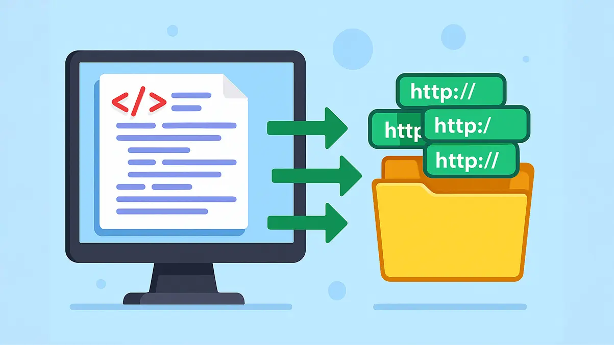
Free XML Sitemap URL Extractor
Easily fetch and download all URLs from any XML sitemap with our free online extractor tool. Perfect for SEO audits, competitor research, and website analysis.
View Tool

Fast YouTube Embed Generator
Generate a lightweight, customized YouTube embed with start/end times and advanced player parameters.
View Tool
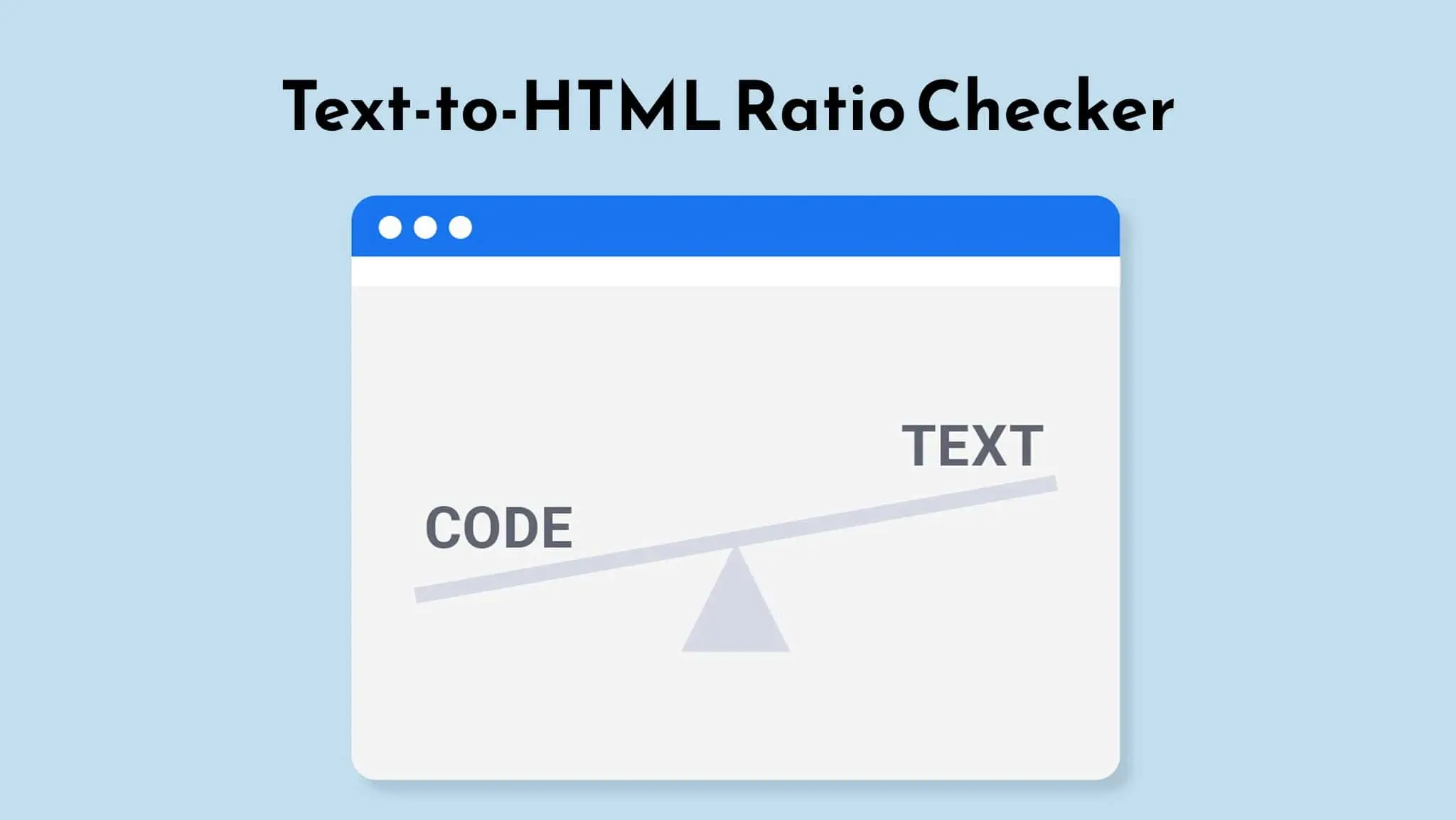
Text-to-HTML Ratio Checker
🚀 Supercharge your SEO with our <span class="text-highlight"> lightning-fast </span> analyzer
View Tool

Open Graph Generator
Generate flawless Open Graph (OG) tags for your website with our Open Graph Generator tool. Boost social sharing and improve your website's visibility on social media platforms. Try it now
View Tool
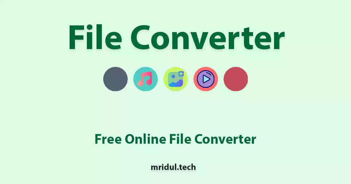
File Converter
Free online file converter tools to convert files online. Convert JPG to PNG, PNG to JPG, JPG to PDF, MP4 to MP3, MP3 to MP4, and more.
View Tool
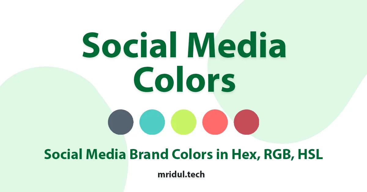
Social Media Colors
Get the color codes for your social media and brands. Choose from different color formats.
View Tool
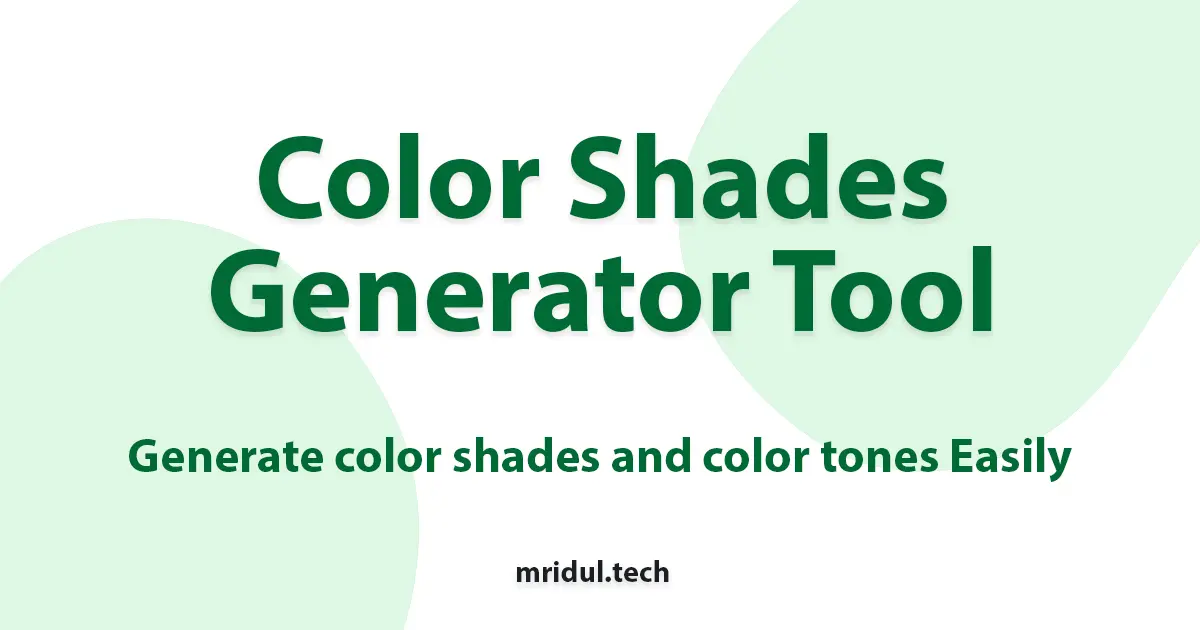
Color Shades Generator
Generate color shades and color tones from a given color. Choose from different color formats.
View Tool
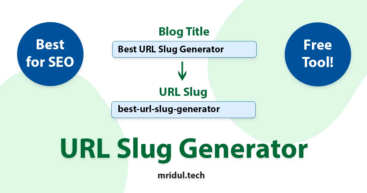
URL Slug Generator
Create the perfect SEO Friendly slug in seconds
View Tool
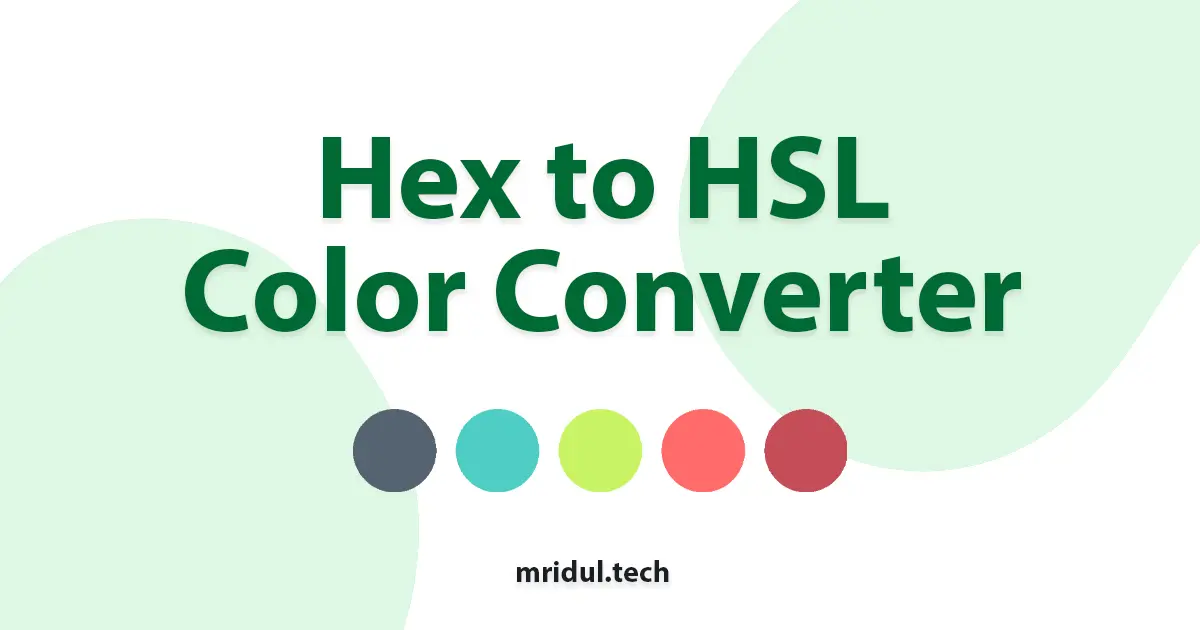
Hex to HSL Color Converter
Convert Hex to HSL color codes. Enter Hex values and get the corresponding HSL color code.
View Tool
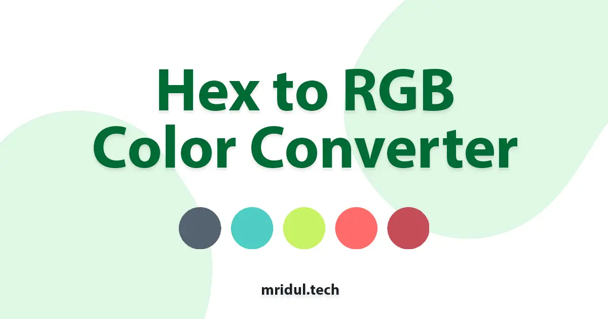
Hex to RGB Color Converter
Convert Hex to RGB color codes. Enter Hex values and get the corresponding RGB color code.
View Tool
HSL to RGB Color Converter
Convert HSL to RGB color codes. Enter HSL values and get the corresponding RGB color code.
View Tool
HSL to Hex Color Converter
Convert HSL to Hex color codes. Enter HSL values and get the corresponding Hex color code.
View Tool
RGB to Hex Color Converter
Convert RGB to Hex color codes. Enter RGB values and get the corresponding Hex color code.
View Tool
RGB to HSL Color Converter
Convert RGB to HSL color codes. Enter RGB values and get the corresponding HSL color code.
View Tool
Do you want more articles on React, Next.js, Tailwind CSS, and JavaScript?
Subscribe to my newsletter to receive articles straight in your inbox.
If you like my work and want to support me, consider buying me a coffee.

Contact Me ☎️
Discuss A Project Or Just Want To Say Hi?
My Inbox Is Open For All.
Connect with me on Social Media