Tailwind CSS Cheat Sheet
Access the ultimate Tailwind CSS cheat sheet. Complete reference for utility classes, components, responsive breakpoints, colors, and typography. Boost your workflow today!
Current Tailwind CSS version: v4.1
Understanding Tailwind's Utility-First Philosophy
Tailwind CSS operates on a fundamentally different paradigm compared to traditional CSS frameworks. Rather than providing pre-designed components, it offers low-level utility classes that can be combined to create any design directly in your markup. This approach eliminates the need for writing custom CSS while maintaining complete control over your design implementation.
Layout and Display Properties
Container and Box Sizing
We utilize the container class to create responsive, centered containers that adapt seamlessly across different viewport sizes. The framework provides precise control over maximum widths at various breakpoints, ensuring consistent layouts across devices.
The box-border and box-content utilities allow us to manipulate how elements calculate their total width and height, providing granular control over spacing and dimensions.
Display Utilities
Tailwind offers comprehensive display properties including block, inline-block, inline, flex, inline-flex, grid, inline-grid, and hidden. These utilities enable us to control element rendering behavior with single-class declarations.
Flexbox Configuration
We leverage Flexbox utilities extensively for creating responsive layouts. The flex-row, flex-col, flex-row-reverse, and flex-col-reverse classes control direction, while flex-wrap, flex-nowrap, and flex-wrap-reverse manage wrapping behavior.
Justify content options include justify-start, justify-end, justify-center, justify-between, justify-around, and justify-evenly, providing complete control over horizontal alignment. Similarly, align-items utilities like items-start, items-end, items-center, items-baseline, and items-stretch handle vertical alignment.
Grid System
The Grid layout system in Tailwind provides powerful two-dimensional layout capabilities. We use grid-cols-{n} to define column counts, grid-rows-{n} for row configurations, and gap-{size} utilities for spacing between grid items.
Column and row spanning is achieved through col-span-{n} and row-span-{n} classes, while grid-flow-row, grid-flow-col, and grid-flow-dense control auto-placement algorithms.
Spacing and Sizing
Margin and Padding
We implement spacing utilities using a consistent scale from 0 to 96, plus additional values like px, auto, and fractional units. The syntax follows patterns like m-{size} for margin and p-{size} for padding, with directional variants including mt (top), mr (right), mb (bottom), ml (left), mx (horizontal), and my (vertical).
Width and Height
Width utilities range from fixed values like w-0 through w-96, to fractional units like w-1/2, w-full, w-screen, w-min, w-max, and w-fit. Height follows identical patterns with h-{size} classes.
Min and max dimensions are controlled through min-w-{size}, max-w-{size}, min-h-{size}, and max-h-{size} utilities, ensuring elements maintain appropriate boundaries.
Typography and Text Styling
Font Families and Sizes
We configure typography using font-sans, font-serif, and font-mono for font families, while text-{size} utilities range from text-xs to text-9xl, providing comprehensive size control.
Font weights span from font-thin (100) to font-black (900), with font-normal (400) and font-bold (700) being most commonly used.
Text Alignment and Decoration
Text alignment is managed through text-left, text-center, text-right, and text-justify. We apply text-decoration using underline, overline, line-through, and no-underline.
Text transform utilities include uppercase, lowercase, capitalize, and normal-case, while text-overflow is controlled via truncate, text-ellipsis, and text-clip.
Line Height and Letter Spacing
We fine-tune readability using leading-{size} for line height adjustments and tracking-{size} for letter spacing modifications. These utilities range from tight to loose, with numeric options for precise control.
Color and Background Utilities
Text and Background Colors
Tailwind provides an extensive color palette with consistent naming across utilities. We apply colors using text-{color}-{shade} and bg-{color}-{shade}, where colors include slate, gray, zinc, neutral, stone, red, orange, amber, yellow, lime, green, emerald, teal, cyan, sky, blue, indigo, violet, purple, fuchsia, pink, and rose.
Shade values range from 50 (lightest) to 950 (darkest), providing eleven distinct shades per color family.
Gradient Backgrounds
We create gradient backgrounds using combinations of bg-gradient-to-{direction}, from-{color}, via-{color}, and to-{color} utilities, where direction options include t (top), tr (top-right), r (right), br (bottom-right), b (bottom), bl (bottom-left), l (left), and tl (top-left).
Borders and Rounded Corners
Border Width and Style
Border utilities include border-{width} for thickness control, with directional variants like border-t, border-r, border-b, and border-l. We apply border colors using border-{color}-{shade} following the same palette as text and backgrounds.
Border styles are defined through border-solid, border-dashed, border-dotted, border-double, and border-none.
Border Radius
We implement rounded corners using utilities ranging from rounded-none to rounded-full, with specific corner control through rounded-tl, rounded-tr, rounded-br, rounded-bl, and side control via rounded-t, rounded-r, rounded-b, and rounded-l.
Effects and Filters
Shadow Effects
Box shadows are applied through shadow-sm, shadow, shadow-md, shadow-lg, shadow-xl, and shadow-2xl, with shadow-none to remove shadows. We also utilize shadow-inner for inset effects and shadow-{color} for colored shadows.
Opacity and Blend Modes
We control opacity using opacity-{value} utilities from 0 to 100, while mix-blend-{mode} and bg-blend-{mode} provide advanced blending capabilities including multiply, screen, overlay, darken, lighten, and many others.
Filters and Backdrop Effects
Filter utilities include blur-{size}, brightness-{value}, contrast-{value}, grayscale, hue-rotate-{angle}, invert, saturate-{value}, and sepia. Corresponding backdrop filters apply these effects to elements behind the target.
Positioning and Z-Index
We control element positioning using static, fixed, absolute, relative, and sticky, combined with inset utilities like top-{size}, right-{size}, bottom-{size}, and left-{size}.
Z-index control is achieved through z-{value} utilities, ranging from z-0 to z-50, plus z-auto for default stacking context.
Responsive Design Breakpoints
Tailwind's responsive design system uses mobile-first breakpoints accessed through prefixes: sm: (640px), md: (768px), lg: (1024px), xl: (1280px), and 2xl: (1536px). We apply any utility at specific breakpoints by prefixing it with the breakpoint name.
Interactive States and Transitions
Hover, Focus, and Active States
We target interactive states using hover:, focus:, active:, visited:, focus-within:, focus-visible:, and disabled: prefixes combined with any utility class.
Transitions and Animations
Transition utilities include transition, transition-all, transition-colors, transition-opacity, transition-shadow, and transition-transform, paired with duration-{time} and ease-{function} for timing control.
Animation classes provide animate-spin, animate-ping, animate-pulse, and animate-bounce for common motion effects.
Transform Utilities
We apply transformations using scale-{value}, rotate-{angle}, translate-x-{size}, translate-y-{size}, skew-x-{angle}, and skew-y-{angle}, with transform-gpu for hardware acceleration.
Accessibility and Screen Reader Utilities
Tailwind includes sr-only and not-sr-only classes for controlling visibility to screen readers while maintaining accessibility standards. These utilities ensure we build inclusive interfaces without compromising design.
Frequently Asked Questions (FAQs)
What is a Tailwind CSS Cheat Sheet?
A Tailwind CSS cheat sheet is a comprehensive reference guide that contains all the utility classes, syntax, and properties available in the Tailwind CSS framework. It serves as a quick lookup resource for developers to find the exact class names they need without constantly referring to the official documentation.
Is Tailwind CSS free to use?
Yes, Tailwind CSS is completely free and open-source. It's released under the MIT License, which means you can use it for personal and commercial projects without any restrictions or licensing fees.
Do I need to memorize all Tailwind CSS classes?
No, you don't need to memorize all classes. The beauty of using a cheat sheet is having a quick reference at your fingertips. Over time, you'll naturally remember the most commonly used utilities, but the cheat sheet remains valuable for less frequent classes.
How do I search for specific utilities in the cheat sheet?
Use your browser's search function (Ctrl+F or Cmd+F) to quickly find specific utilities. You can search by property name (like "padding," "flex," or "color") or by class prefix (like "p-", "flex-", or "bg-").
How often is this cheat sheet updated?
We update this cheat sheet regularly to reflect new Tailwind CSS releases, feature additions, and community feedback. Major updates typically follow official Tailwind CSS version releases.
What does "utility-first" mean in Tailwind CSS?
Utility-first means building designs by composing small, single-purpose utility classes directly in your HTML rather than writing custom CSS. Each class does one thing well, and you combine them to create complex designs.
More Tools like Tailwind CSS Cheat Sheet

Manifest Generator
Generate accurate manifests with our Manifest Generator tool. Streamline your processes effortlessly. Try today for efficient manifest creation.
View Tool

Youtube Thumbnail Downloader
A YouTube Thumbnail Downloader is a simple tool that lets you grab thumbnails from any YouTube video in just seconds. Paste the video link, hit download, and boom—you’ve got the thumbnail saved in high resolution.
View Tool

AI Directory
AI content writers, AI image generators, music creation tools, writing tools, Search engine optimization, translation, and more.
View Tool

Free XML Sitemap URL Extractor
Easily fetch and download all URLs from any XML sitemap with our free online extractor tool. Perfect for SEO audits, competitor research, and website analysis.
View Tool

Fast YouTube Embed Generator
Generate a lightweight, customized YouTube embed with start/end times and advanced player parameters.
View Tool
Text-to-HTML Ratio Checker
🚀 Supercharge your SEO with our lightning-fast analyzer
View Tool

Open Graph Generator
Generate flawless Open Graph (OG) tags for your website with our Open Graph Generator tool. Boost social sharing and improve your website's visibility on social media platforms. Try it now
View Tool
File Converter
Free online file converter tools to convert files online. Convert JPG to PNG, PNG to JPG, JPG to PDF, MP4 to MP3, MP3 to MP4, and more.
View Tool
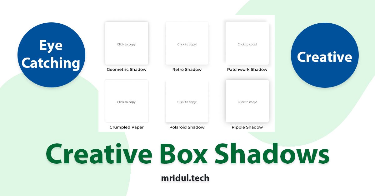
CSS Box Shadows
Elevate your website's visual appeal and engage your audience like never before with CSS Box Shadows.
View Tool

Social Media Colors
Get the color codes for your social media and brands. Choose from different color formats.
View Tool

Color Shades Generator
Generate color shades and color tones from a given color. Choose from different color formats.
View Tool

URL Slug Generator
Create the perfect SEO Friendly slug in seconds
View Tool

Hex to HSL Color Converter
Convert Hex to HSL color codes. Enter Hex values and get the corresponding HSL color code.
View Tool
Hex to RGB Color Converter
Convert Hex to RGB color codes. Enter Hex values and get the corresponding RGB color code.
View Tool

HSL to RGB Color Converter
Convert HSL to RGB color codes. Enter HSL values and get the corresponding RGB color code.
View Tool

HSL to Hex Color Converter
Convert HSL to Hex color codes. Enter HSL values and get the corresponding Hex color code.
View Tool

RGB to Hex Color Converter
Convert RGB to Hex color codes. Enter RGB values and get the corresponding Hex color code.
View Tool

RGB to HSL Color Converter
Convert RGB to HSL color codes. Enter RGB values and get the corresponding HSL color code.
View Tool
Contact Me ☎️
Discuss A Project Or Just Want To Say Hi?
My Inbox Is Open For All.
Connect with me on Social Media


